Activities of "paul.harriman"
Thanks for the response. I will give this a try when 4.3 is released and we upgrade our solutions. It looks like the code which I got caught in has been changed.
fromEvent(window, 'beforeunload')
  .pipe(takeUntil(this.destroy$))
  .subscribe(event => {
    event.preventDefault();
    if (this.isFormDirty && !this.suppressUnsavedChangesWarning) {
      event.returnValue = true;
** } else { delete event.returnValue; }** });
- ABP Framework version: v4.2.0
- UI type: Angular
- DB provider: EF Core
- Tiered (MVC) or Identity Server Separated (Angular): yes / no
- Exception message and stack trace:
- Steps to reproduce the issue:
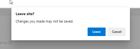
We are using a npm package that determines if the user has been idle for x minutes. The package works ok when the user is not in a modal. If the user is in a modal, the user gets the dialog below after calling authService.logout
To try and get around this, I added some code to remove all .ng-dirty before calling authService.logout, but I am still presented with the dialog from the window:beforeunload. I still want the user to be presented with a dialog if they make changes to a form and then forget to save the form, so I do not want to shut off the "are you sure you want to leave" entirely, just when they have been idle for more than x minutes. How do I logout the user and bring them back to the login screen without the dialogs?
Mehmet, is there any documentation that talks about being able to disable the dynamic loading of css? I assume this will stop all the Style1-6 from being loaded? Which version of ABP is this enhancement in?
This solution still have problems, when you have both lepton theme source code and account source code, you cannot change the style of the theme, (you still read the value from node module)
Hi Paul
- The theme-lepton library gets style files from
node_modules/@volo/abp.ng.theme.lepton/distfolder. You should overwrite the CSS files after building. So you can use a command to achieve this like the following:yarn ng build theme-lepton && cp -r packages/theme-lepton/dist dist/theme-leptonThen check the styles in
dist/theme-lepton/dist/stylesfolder. You will see your edited styles there.
- You should add a variable named appInfo. This custom footer component works:
import { EnvironmentService } from '@abp/ng.core';
import { Component } from '@angular/core';

@Component({
  selector: 'app-footer',
  template: `
    <footer class="lp-footer">
      <div class="d-flex">
        <div class="mr-auto">
          <span>2019 - {{ currentYear }} © {{ appInfo.name }}</span
> > ><br />
    </div>
  </div>
</footer>
`,
styleUrls: ['./footer.component.scss'],
})
export class FooterComponent {
currentYear = new Date().getFullYear();get appInfo() {
return this.environment.getEnvironment().application;
}constructor(private environment: EnvironmentService) {}
}3. Here is the `tsconfig.prod.json`:{
"compileOnSave": false,
"compilerOptions": {
"baseUrl": "./",
"outDir": "./dist/out-tsc",
"sourceMap": true,
"declaration": false,
"downlevelIteration": true,
"experimentalDecorators": true,
"module": "esnext",
"moduleResolution": "node",
"importHelpers": true,
"target": "es2015",
"typeRoots": ["node_modules/@types"],
"lib": ["es2018", "dom"],
"types": ["jest"]
},
"angularCompilerOptions": {
"fullTemplateTypeCheck": true,
"strictInjectionParameters": true
}
}`tsconfig.json`:{
"extends": "./tsconfig.prod.json",
"compilerOptions": {
"paths": {
"@volo/abp.commercial.ng.ui": ["packages/commercial-ui/src/public-api.ts"],
"@volo/abp.ng.account": ["packages/account/src/public-api.ts"],
"@volo/abp.ng.account/config": ["packages/account/config/src/public-api.ts"],
"@volo/abp.ng.account/admin": ["packages/account/admin/src/public-api.ts"],
"@volo/abp.ng.audit-logging": ["packages/audit-logging/src/public-api.ts"],
"@volo/abp.ng.audit-logging/config": ["packages/audit-logging/config/src/public-api.ts"],
"@volo/abp.ng.identity-server": ["packages/identity-server/src/public-api.ts"],
"@volo/abp.ng.identity-server/config": ["packages/identity-server/config/src/public-api.ts"],
"@volo/abp.ng.identity": ["packages/identity/src/public-api.ts"],
"@volo/abp.ng.identity/config": ["packages/identity/config/src/public-api.ts"],
"@volo/abp.ng.saas": ["packages/saas/src/public-api.ts"],
"@volo/abp.ng.saas/config": ["packages/saas/config/src/public-api.ts"],
"@volo/abp.ng.theme.lepton": ["packages/theme-lepton/src/public-api.ts"],
"@volo/abp.ng.theme.lepton/": ["packages/theme-lepton/src/lib/"],
"@volo/abp.ng.language-management": ["packages/language-management/src/public-api.ts"],
"@volo/abp.ng.language-management/config": [
"packages/language-management/config/src/public-api.ts"
],
"@volo/abp.ng.language-management/locale": ["packages/language-management/locale/src/public-api.ts"],
"@volo/abp.ng.text-template-management": [
"packages/text-template-management/src/public-api.ts"
],
"@volo/abp.ng.text-template-management/config": [
"packages/text-template-management/config/src/public-api.ts"
]
}
}
}
Yes we are already doing what u r describing. Every new version of ABP we repeat the procedure again, so not an ideal solution. It would make things even easier if ABP would use the vars they create (perhaps they do this b/c of older browsers). Another method which we use is i load the style being used as a class in the body. then in style.scss i can create styles like
.Style1 .lp-footer {
// these styles only affect this style and not globally. this is being done so i can use Style1 as our specific brand. this allows
// me to change the background color of the footer. We still run into issues where ABP uses styles that are !important that I am
// not able to override. an example of this is with the pick lists and errors, like the user submitted and didn't enter the data
// required (we do not disable the submit button if there are form errors, b/c we feel it's a bad user experience if the user cannot
// see any visual of what is wrong with the form).
}
As for footer, i was able to replace the footer component with a custom footer component.
Check the docs before asking a question: https://docs.abp.io/en/commercial/latest/ Check the samples, to see the basic tasks: https://docs.abp.io/en/commercial/latest/samples/index The exact solution to your question may have been answered before, please use the search on the homepage.
- ABP Framework version: v4.2.0
- UI type: Angular
- DB provider: EF Core
- Tiered (MVC) or Identity Server Separated (Angular): yes / no
- Exception message and stack trace:
- Steps to reproduce the issue:
- create a modal that will scroll
- add the control abp-lookup-input
- show the modal
- modal will scroll fine.
- click pick to show choices, then either pick or cancel
- you are brought back to the modal, you cannot scroll the modal. the page behind the modal does scroll
- with dev tools, notice on the html > body the class modal-open is missing, add it back with dev-tools and modal will scroll again.
- so the abp-lookup-input is removing the modal-open class prematurely.
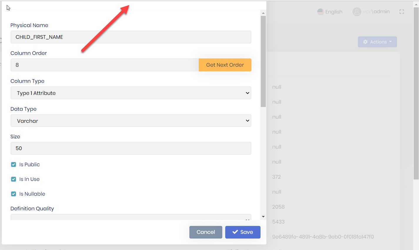
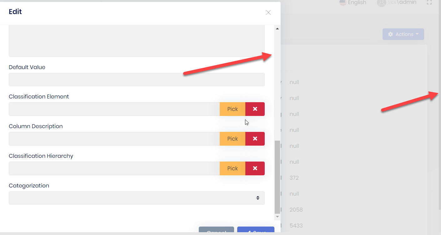
- follow the advice for https://support.abp.io/QA/Questions/771/Scroll-up-and-down-get-Freeze-after-select-the-data-in-pick-up-view, add modalClass="modal-dialog-scrollable" to abp-modal control. you get a modal that has 2 scrolls. repeat steps 5-6 and you get clipping on the top or bottom of the modal
double scroll, scroll on inside, visible, and if you look very closely on the right hand edge you can see a very thin scrollbar
Which r u looking for? Solution 2?
I', going with the first solution. I have to do some ui repair as moving the footer creates some visual issues. the send solution did not work for me.
Is the functionality for Lepton Angular Theme Customization available now in 4.2? I looked through the documentation for something that would tell me how to use it, but didn't see anything.
Check the docs before asking a question: https://docs.abp.io/en/commercial/latest/ Check the samples, to see the basic tasks: https://docs.abp.io/en/commercial/latest/samples/index The exact solution to your question may have been answered before, please use the search on the homepage.
- ABP Framework version: v4.0.2
- UI type: Angular
- DB provider: EF Core
- Tiered (MVC) or Identity Server Seperated (Angular): yes / no
- Exception message and stack trace:
- Steps to reproduce the issue:
Have a form in a modal with validation. For simplicity mark fields as required
component.html <abp-modal [(visible)]="isModalVisible" [busy]="modalBusy" (disappear)="form = null"> <ng-template #abpHeader> <h3>{{ (selected?.id ? 'AbpUi::Edit' : 'HR::NewEmployeeExperience') | abpLocalization }}</h3> </ng-template>
<ng-template #abpBody> <form [formGroup]="form" validateOnSubmit> <div class="mt-2 fade-in-top"> <div class="form-group"> <label for="employeeExperience-workplace"> {{ 'HR::Workplace' | abpLocalization }} </label> <span class="req-mark"> * </span> <input type="text" id="employeeExperience-workplace" class="form-control" formControlName="workplace" /> </div> <div class="form-group"> <label for="employeeExperience-seniority"> {{ 'HR::Seniority' | abpLocalization }} </label> <span class="req-mark"> * </span> <input type="number" id="employeeExperience-seniority" class="form-control" formControlName="seniority" /> </div> <div class="form-group"> <label for="employeeExperience-position"> {{ 'HR::Position' | abpLocalization }} </label> <span class="req-mark"> * </span> <input type="text" id="employeeExperience-position" class="form-control" formControlName="position" /> </div> </div> </form> </ng-template>
<ng-template #abpFooter> <button type="button" class="btn btn-secondary" #abpClose> {{ 'AbpUi::Cancel' | abpLocalization }} </button>
<abp-button iconClass="fa fa-save" (click)="save()">
  {{ 'AbpUi::Save' | abpLocalization }}
</abp-button>
</ng-template> </abp-modal>
component.ts buildForm() { this.form = this.fb.group({ employeeCode: [this.employeeCode || '', [Validators.required]], workplace: [this.selected.workplace || '', [Validators.required]], seniority: [this.selected.seniority || '', [Validators.required]], position: [this.selected.position || '', [Validators.required]], }); }
submitForm(): void { if (this.form.invalid) { return; } .... remaining logic to do update }
don't enter any data, click save. the click will send it to the component, and indeed the form is invalid. the form is not marked up b/c validateOnSubmit is not triggered, the user cannot visually see what the issue is. i tried to move the form html element after <abp-modal [(visible)]="isModalVisible" [busy]="modalBusy" (disappear)="form = null"> so it would wrap all the ng-template. I also removed the click event and replaced it with a buttonType="submit" the html form element is not rendered.
Check the docs before asking a question: https://docs.abp.io/en/commercial/latest/ Check the samples, to see the basic tasks: https://docs.abp.io/en/commercial/latest/samples/index The exact solution to your question may have been answered before, please use the search on the homepage.
- ABP Framework version: v4.0.2
- UI type: Angular
- DB provider: EF Core
- Tiered (MVC) or Identity Server Seperated (Angular): yes / no
- Exception message and stack trace:
- Steps to reproduce the issue:
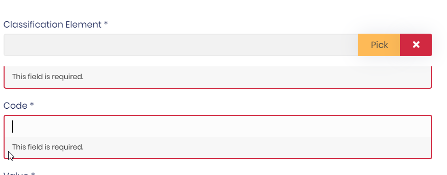
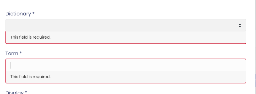
I have a abp-lookup-input in a model driven form. the field is required. the error display wen trying to submit the form is not very aesthetic. abp-lookup-select error display is not as bad but is not display like a input field
