Activities of "enisn"
Thanks for your feedback, We'll make it more visible in the template and documentation.
Hi @improwise
As mentioned in article, Secure Storage requires platform-specific configuration. Preferences usage is for development purposes. You should replace it for production.
As @woodyarray says
lpx-logo-icon parameter is for the icon for collapsed state.
--lpx-logo-icon: url('/images/logo/logo-icon.svg') !important;
Make sure both Authentication Server and Client Application styles are updated if you're using a tiered architecture
Hi @p.j.keukens
You can override the EntityHistoryHelper in your project to achieve solution in your app on your version.
[Dependency(ReplaceServices = true)]
[ExposeServices(typeof(EntityHistoryHelper))]
public class MyEntityHistoryHelper  : EntityHistoryHelper
{
     protected override List<EntityPropertyChangeInfo> GetPropertyChanges(EntityEntry entityEntry)
    {
        var propertyChanges = new List<EntityPropertyChangeInfo>();
        var properties = entityEntry.Metadata.GetProperties();
        var isCreated = IsCreated(entityEntry);
        var isDeleted = IsDeleted(entityEntry);

        foreach (var property in properties)
        {
            var propertyEntry = entityEntry.Property(property.Name);
            if (ShouldSavePropertyHistory(propertyEntry, isCreated || isDeleted) && !IsSoftDeleted(entityEntry))
            {
                propertyChanges.Add(new EntityPropertyChangeInfo
                {
                    NewValue = isDeleted ? null : JsonSerializer.Serialize(propertyEntry.CurrentValue).TruncateWithPostfix(YOUR_CUSTOM_VALUE),
                    OriginalValue = isCreated ? null : JsonSerializer.Serialize(propertyEntry.OriginalValue).TruncateWithPostfix(YOUR_CUSTOM_VALUE),
                    PropertyName = property.Name,
                    PropertyTypeFullName = property.ClrType.GetFirstGenericArgumentIfNullable().FullName
                });
            }
        }
}
Replace the YOUR_CUSTOM_VALUE with your requirement.
Also you can remove TruncateWithPostfix() method completely.
Hi
App.razor
You can create a App.razor file in your application and use it via configuring it in the Module file of your application for Blazor WASM and _Host.cshtml for Blazor Server
MyApp.razor
@using Microsoft.Extensions.Options
@using Microsoft.Extensions.Localization
@using Volo.Abp.AspNetCore.Components.Web.LeptonXTheme
@using Volo.Abp.AspNetCore.Components.Web.LeptonXTheme.Components
@using global::Localization.Resources.AbpUi
@using Volo.Abp.AspNetCore.Components.Web.LeptonXTheme.Components.ApplicationLayout
@using Volo.Abp.AspNetCore.Components.Web.Theming.Routing
@inject IOptions<AbpRouterOptions> RouterOptions
@inject IOptions<LeptonXThemeBlazorOptions> LayoutOptions

@inject IStringLocalizer<AbpUiResource> UiLocalizer
<CascadingAuthenticationState>
    <Router AppAssembly="RouterOptions.Value.AppAssembly"
            AdditionalAssemblies="RouterOptions.Value.AdditionalAssemblies">
        <Found Context="routeData">
            <AuthorizeRouteView RouteData="@routeData" DefaultLayout="@LayoutOptions.Value.Layout">
                <NotAuthorized>
                    @if (context.User?.Identity?.IsAuthenticated == false)
                    {
                        <RedirectToLogin/>
                    }
                    else
                    {
                         <ErrorView
                            Title="@UiLocalizer["403Message"]"
                            HttpStatusCode="403"
                            Message="@UiLocalizer["403MessageDetail"]"/>
                    }
                </NotAuthorized>
            </AuthorizeRouteView>
        </Found>
        <NotFound>
            <LayoutView Layout="@LayoutOptions.Value.Layout">
                <ErrorView
                    Title="@UiLocalizer["404Message"]"
                    HttpStatusCode="404"
                    Message="@UiLocalizer["404MessageDetail"]"/>
            </LayoutView>
        </NotFound>
    </Router>
</CascadingAuthenticationState>
       var builder = context.Services.GetSingletonInstance<WebAssemblyHostBuilder>();
       builder.RootComponents.Add<MyApp>("#ApplicationContainer");
If you're using Blazor-Server, Go to your Pages/_Host.cshtml and change App to MyApp
<component type="typeof(MyApp)" render-mode="Server" />
Imports.razor
Multiple Imports.razor can be used in a blazor project. So you can create a new _Imports.razor wherever you want in your application. It'll be applied to its own folder and subfolders.
Sorry about it, that was my test project name.
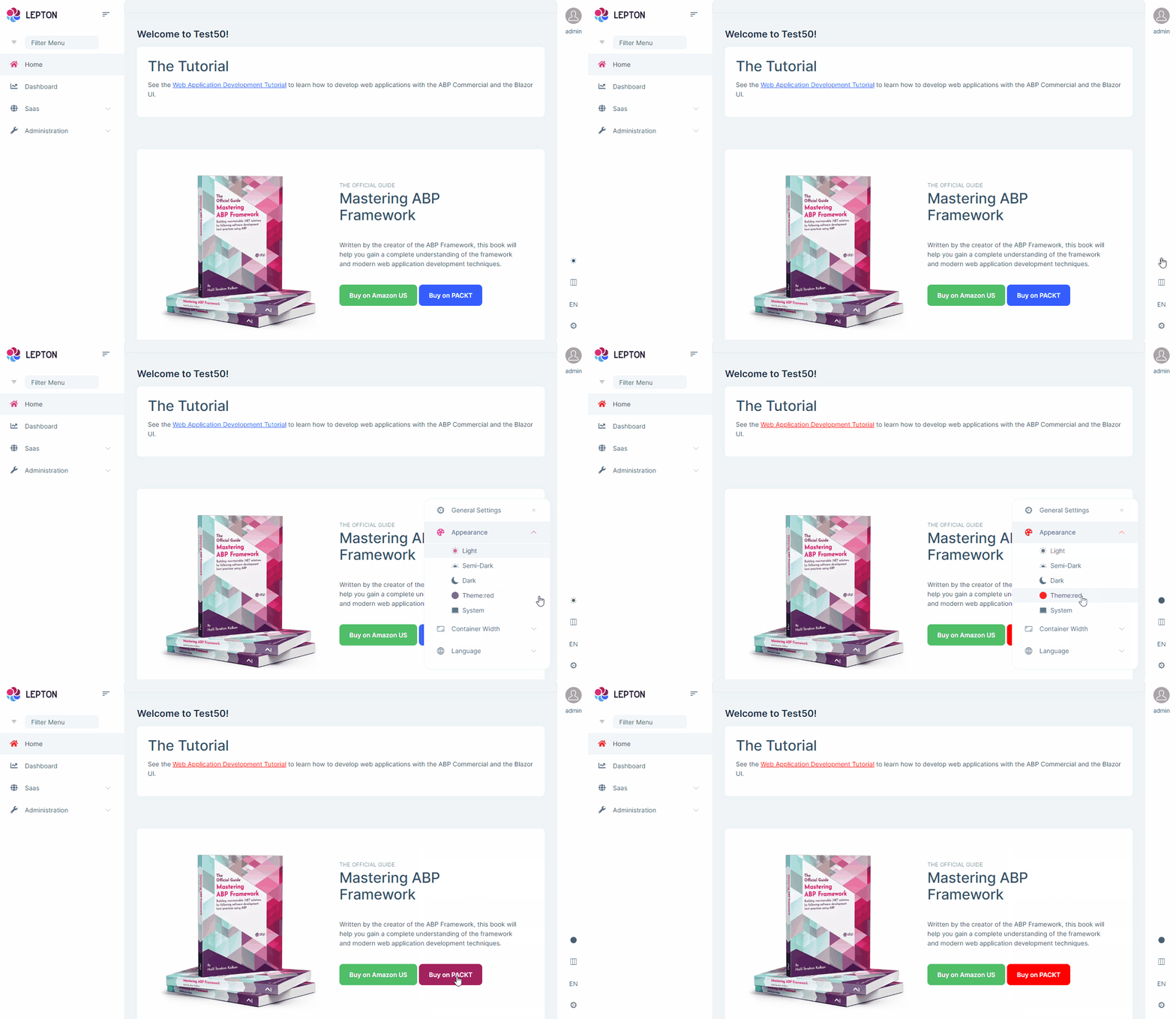
LeptonX uses IStringLocalizerFactory to localize theme names.
If you use a resource that configured in your application, it'll work.
LocalizableString.Create<AppMicroResource>("Theme:Red")
The example below should work. Can you check which resource is configured in your Domain.Shared module class?
Isn't it something like below?
Configure<AbpLocalizationOptions>(options =>
{
    options.Resources
        .Add<AppMicroResource>("en")
        .AddBaseTypes(typeof(AbpValidationResource))
        .AddVirtualJson("/Localization/AppMicroResource");
});
Hi @hakan.uskuner
It seems there is a mistake in the documentation.
Blazor has a special case while providing embedded resources. It accesses resources via assembly name. So place you files under wwwroot/_content/Volo.Abp.AspNetCore.Components.Web.LeptonXTheme/side-menu/css/ folder.
Configured them in Module file
Configure<LeptonXThemeOptions>(options =>
{
    options.DefaultStyle = LeptonXStyleNames.System;

    // Adding a new theme
    options.Styles.Add("red",
        new LeptonXThemeStyle(
        LocalizableString.Create<Test50Resource>("Theme:Red"),
        "bi bi-circle-fill"));
});
Your credit is refunded since there is a mistake in documentation,
You can find documentation of all tag helpers from here: https://docs.abp.io/en/abp/latest/UI/AspNetCore/Tag-Helpers/Index
You can visit Form Elements section for abp-input
https://docs.abp.io/en/abp/latest/UI/AspNetCore/Tag-Helpers/Form-elements
Setting Management doesn't provide any UI component automatically like feature management. You should implement it yourself. If you store data in database, you should write a Custom Setting Value Provider and AppServices for it.
Rendering your custom component in UI
You should define your view like email settings here: https://github.com/abpframework/abp/blob/dev/modules/setting-management/src/Volo.Abp.SettingManagement.Web/Pages/SettingManagement/Components/EmailSettingGroup/Default.cshtml
And Create a SettingPage Contributo that inherits from SettingPageContributorBase
https://github.com/abpframework/abp/blob/b515f89b9f465b462c81e62a2b1bbd2093d96b75/modules/setting-management/src/Volo.Abp.SettingManagement.Web/Settings/EmailingPageContributor.cs#L21-L25
- Configure your contributor in SettingManagementPageOptions
Configure<SettingManagementPageOptions>(options =>
{
    options.Contributors.Add(new YourSettingPageContributor());
});
That's it, your component will be visible on UI
Hi,
We're hardly working on documentation currently.
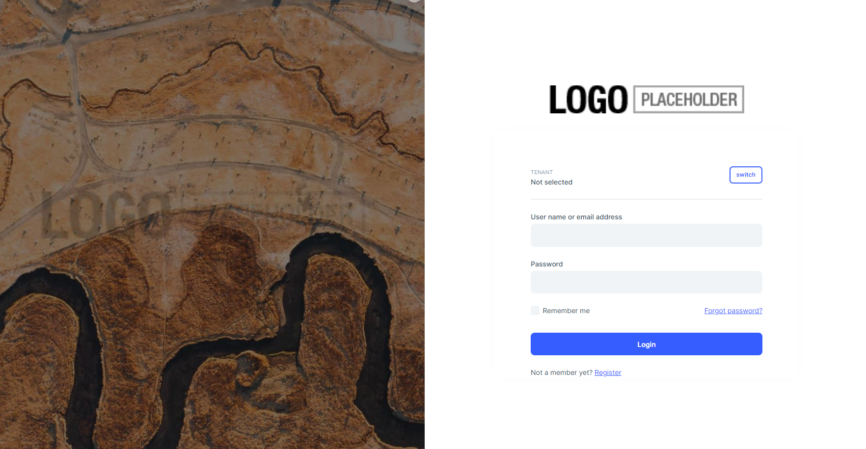
The watermark is the same with logo that you used.
You can customize the logo with following CSS:
:root {
    --lpx-logo: url('/images/logo/logo-dark.png') !important;
    --lpx-logo-icon: url('/images/logo/logo-dark-icon.png');
    --lpx-brand: #edae53;
 }
Even you can set it according to the theme
  :root {
    .lpx-theme-dark {
      --lpx-logo: url('/images/logo/logo-dark.png');
      --lpx-logo-icon: url('/images/logo/logo-dark-icon.png');
      --lpx-brand: #edae53;
    }

    .lpx-theme-dim {
      --lpx-logo: url('/images/logo/logo-light.png.png');
      --lpx-logo-icon: url('/images/logo/logo-light-icon.png.png');
      --lpx-brand: #f15835;
    }

    .lpx-theme-light {
      --lpx-logo: url('/images/logo/logo-light.png.png') !important;
      --lpx-logo-icon: url('/images/logo/logo-light.png-icon.png');
      --lpx-brand: #69aada;
    }
}


