- ABP Framework version: v6.0.1
- UI type: MVC
- DB provider: EF Core
- Tiered (MVC) or Identity Server Separated (Angular): yes
We need to support accessibility on the public website.
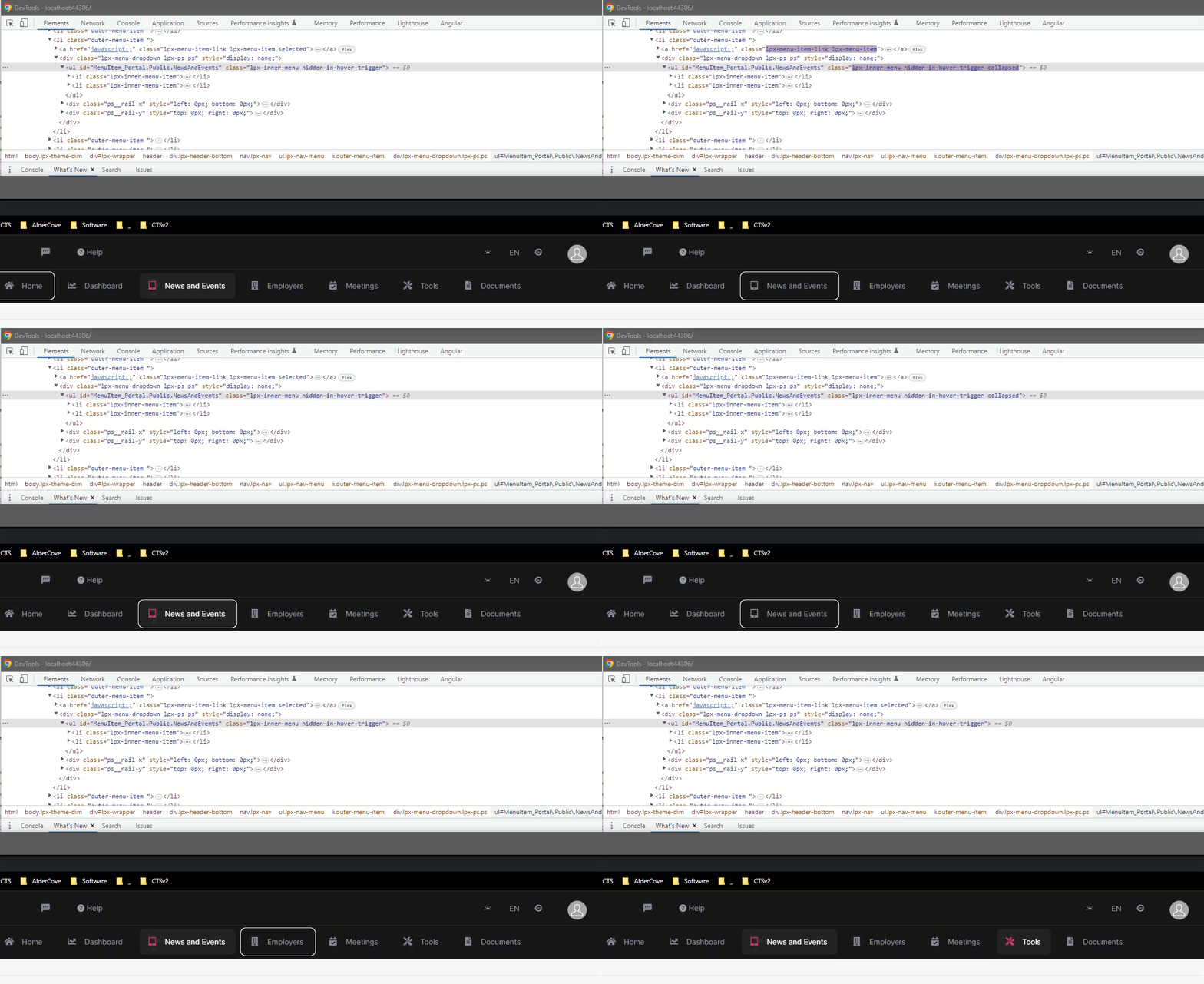
When tabbing through the menu items, the main menu items with children are skipped over and cannot be accessed by the keyboard.
The behaviour should:
- Support tabbing to these menu items
- Open the sub-menu when the user presses the enter key
This issue was partially addressed in the Lepton theme here but doesn't work with the Lepton-X theme: https://support.abp.io/QA/Questions/3314/Adding-support-to-sub-menus-on-the-main-menu-for-keyboard-accessibility
In this example, the News and Event and Tools have sub-menus:

4 Answer(s)
-
0
I fixed the tabbing issue by overriding the LeptonX/Components/TopMenu/MainMenu/_MenuItem.cshtml and adding the href="javascript:'" in the top-level menu item:
<a href="javascript:;" class="lpx-menu-item-link lpx-menu-item @(Model.IsActive ? "selected" : "")">
	X
	@if (!Model.MenuItem.Icon.IsNullOrEmpty())
	{
		<span class="lpx-menu-item-icon"><i class="lpx-icon @Model.MenuItem.Icon" aria-hidden="true"></i></span>
	}

	<span class="lpx-menu-item-text hidden-in-hover-trigger">@Model.MenuItem.DisplayName</span>
</a>
The menu still needs to dropdown on enter though.
-
0
Just adding a little more info - with the tab issue resolved:
- The lpx-inner-menu "collapsed" class is correctly being applied to the submenu unordered list element
- The enclosing lpx-menu-dropdown div and child lpx-inner-menu-item elements are not being displayed
I have messed around a little to try and get these elements to display:
1-) Updated the outer-menu-item list item in \Themes\LeptonX\Components\TopMenu\MainMenu\Default.cshtml to conditionally (if not a leaf) have "has-drop" class:
<li class="outer-menu-item @(!menuItem.MenuItem.IsLeaf ? "has-drop" : "")"> @await Html.PartialAsync("~/Themes/LeptonX/Components/TopMenu/MainMenu/_MenuItem.cshtml", menuItem) </li>
2-) Added menu.js (as in https://support.abp.io/QA/Questions/3314/Adding-support-to-sub-menus-on-the-main-menu-for-keyboard-accessibility) that adds/removes the 'open' class for the list items with 'has-drop' on click events:
$(function () {
    var menuItems = document.querySelectorAll('li.has-drop');
    Array.prototype.forEach.call(menuItems, function (el, i) {
        el.querySelector('a').addEventListener("click", function (event) {
            if (this.parentNode.classList.contains("has-drop")) {
                if (!this.parentNode.classList.contains("open"))
                    this.parentNode.classList.add('open');
                else
                    this.parentNode.classList.remove('open');
            } else {
                this.parentNode.className = "has-submenu";
                this.setAttribute('aria-expanded', "false");
            }

            event.preventDefault();
            return false;
        });
    });
});
3-) Added a bit of css to handle the open class:
.lpx-header-bottom .lpx-nav-menu .outer-menu-item.open > .lpx-menu-dropdown {
    visibility: visible;
    opacity: 1;
    height: unset;
    display: block !important;
}

.lpx-header-bottom .lpx-nav-menu .outer-menu-item.open > .lpx-menu-dropdown .lpx-inner-menu .lpx-inner-menu-item .lpx-menu-item-link {
    display: flex;
    color: var(--lpx-content-text);
    white-space: nowrap;
    padding: 0.4em 0.7em;
    border-radius: var(--lpx-radius);
    text-decoration: none;
    transition: background-color 0.5s ease, color 0.25s ease;
}

.lpx-header-bottom .lpx-nav-menu .outer-menu-item.open > .lpx-menu-dropdown .lpx-menu-item {
    width: 100%;
    height: auto;
    line-height: 1.5;
}
Although I'm pretty certain this isn't the preferred approach, it almost works. The issue appears to be the incorrect height of the submenu. In this example, the submenu should show two options but only part of the first is visible (hover works fine):
Appreciate your help on this - its very urgent for us.
Thanks
-
0
Hi,
I will check it
-
0
Hello, I'm sorry that I can't recommend a workaround right now. It is caused by a plugin that we utilize, thus finding a workaround is far more difficult than tackling the problem itself. As a result, we will be releasing a new version of 'LeptonX' soon; unfortunately, I can only recommend that you wait for it. I believe you will accept it with grace.

